# Flex Boxes
### Basisstappen om Flexbox te gebruiken
- Voeg `display: flex;` toe aan de container.
- Gebruik eigenschappen zoals:
- **`justify-content`**: Hiermee regel je hoe de items horizontaal worden uitgelijnd. Bijvoorbeeld: `justify-content: center;` zet de items in het midden.
- **`align-items`**: Dit regelt de verticale uitlijning van de items.
- **`flex-wrap`**: Hiermee kun je ervoor zorgen dat de items naar een volgende rij gaan als er te weinig ruimte is.
```css
.container {
display: flex;
justify-content: center;
align-items: center;
}
.item {
width: 100px;
height: 100px;
background-color: lightblue;
margin: 10px;
}
```
#### flex-basis
Stel, je wilt dat een container de hele breedte van de pagina in beslag neemt dan pas je het item aan
```css
.container {
display: flex;
}
.item {
flex-basis: 100%;
}
```
More on: [https://css-tricks.com/snippets/css/a-guide-to-flexbox/](https://css-tricks.com/snippets/css/a-guide-to-flexbox/)
#### Basis structuur
[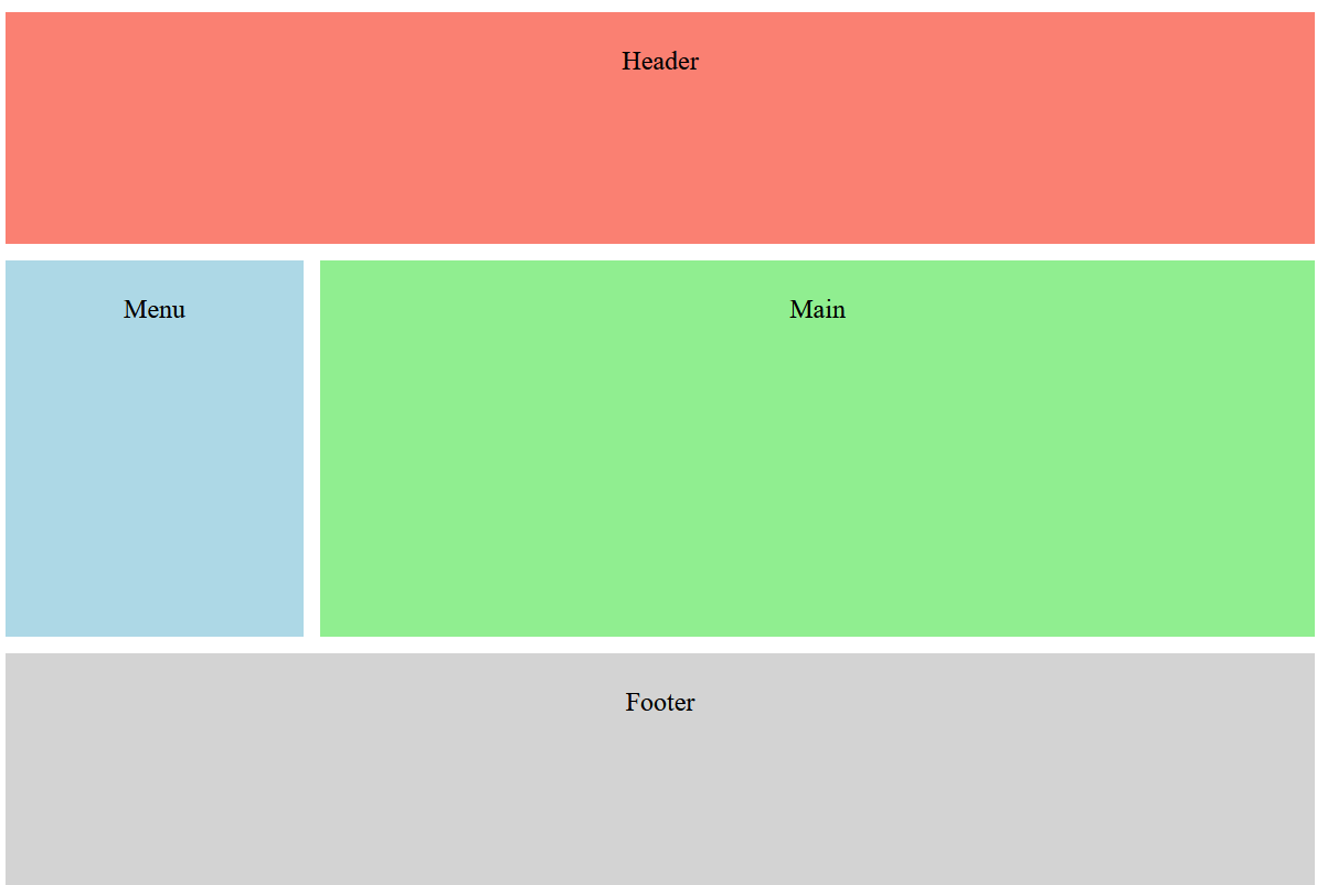](https://www.roc.ovh/uploads/images/gallery/2024-10/vMHimage.png)
```html
```
#### `flex: 0 0 100px;`
- The item will not grow (`flex-grow: 0`).
- The item will not shrink (`flex-shrink: 0`).
- The item has a fixed size of 100 pixels (`flex-basis: 100px`).
xx